I've mentioned a few times this year, both here and on social media, that the current levels of volatility may seem quite high (certainly compared to the more 'normal' recent levels), but these are nowhere near the levels seen in 2008.
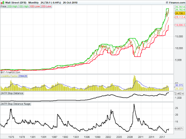
To show what I am talking about, at the bottom of this post I've shown the monthly chart of the Dow going back to the early 1970's. And then, I created a simple measurement to show the change in volatility, by taking the typical 2ATR measurement calculation and expressing this as a percentage of current price.
You can clearly see that current levels of volatility are near the bottom of the range. The lowest reading over the last 40-odd years was at the end of 2017.
In purely numerical terms, they only appear to be high as the actual price of the Dow is at such elevated levels compared to when the previous volatility spikes occurred.
But we can clearly see that, by looking at the modified ATR percentage measurement, the highest levels were shown in 1974, 1987, 2003 and 2008.
In all cases the modified ATR reading went over 20, and in 2008 it was closer to 30. The current level is still below 10.
So in reality, for the current levels of volatility to be truly comparable to those years, the 2ATR measurement has to more than double!
So if you are freaking out at the current level of volatility, this may provide you with some food for thought.


No comments:
Post a Comment