It is more unusual for me to get setups which meet my own criteria in these markets, but they do add some diversification to what I do.
Below are some charts showing some recent trending movements in these markets, as well as highlighting some of the aspects I look for when taking a trade (or not).
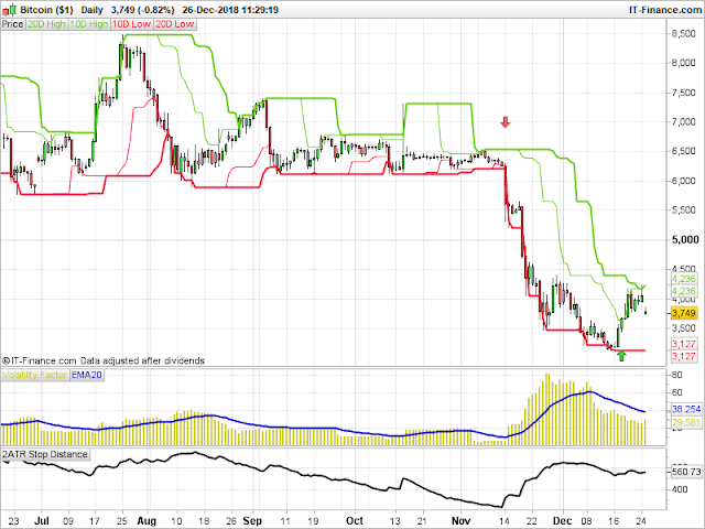
And we start with Bitcoin. What a difference a year makes! Last December Bitcoin peaked close to the 20,000 level. Things are somewhat different now. But, should you trade cryptocurrencies, the trend following principles which would have allowed you to profit from the uptrends in 2017 and earlier years still apply.
Had you taken the the short entry presented to you a few weeks back you would have benefited from the recent downtrend:
A look at a longer-term chart would have shown that the area around the 6,000 area had been tested a number of times during the year. So when price was finally able to break through, there was a chance that a decent move would follow.
As we can see that is what happened, with a nice sharp downtrend. Bitcoin triggered an exit on 18 December, leaving a cleared profit just north of +10R.
The interesting thing on the chart is the is the extreme contraction in price and volatility before price broke out to the downside.
This is a key part of what I look for in a price set up, and is highlighted by the very low reading in the volatility factor indicator, as well as the low 2ATR measurement.
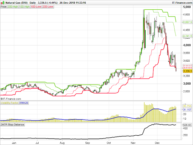
Speaking of violent breakouts, in November Natural Gas experienced such a movement to the upside:
Earlier this summer, the 2ATR reading was at its lowest level since the late 1990's! Following the breakout, this reached its highest level since the spring of 2014.
Personally, I don't trade gaps through an entry level - I only ever enter new trades when price moves through a breakout level, so this was a signal that didn't interest me. But what this chart does show is how an instrument which has long remained 'dormant' in trend following terms can suddenly explode into life.
And as we can see, the excitement has somewhat abated for the time being - an exit signal was given on 12 December, and price has continued to move back to the downside.
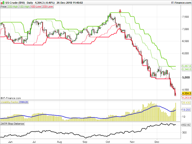
Crude oil is currently generating a decent move to the downside. Here I have shown US Crude (the chart for Brent Crude shows similar characteristics).
Again, another clear downtrend which 'seemingly' came out of nowhere, and which came shortly after price made a new high for the year near the end of September, tried to move higher and quickly failed:
As things stand, this currently shows an open profit close to +9R.
So these charts show the potential upside on what can happen - if you like, these are the 'well chosen examples' showing what a trend following method can achieve.
So it is only right we now look at the downside.
What you will also see on all these charts is plenty of failed breakouts, where no profitable trend developed. While some of these were not valid signals based on my own rules (which include the volatility contraction I mentioned above) it is these failed breakouts where all the small losses are clocked up as a cost of doing business.
My own rules are constructed so that the 'trigger' for entering the trade is a price breakout. If price reverses and falls back the wrong side of the entry level, then the breakout has failed, and the reason for entering is no longer applicable. So I get out and move on.
Remember, as a trend follower the majority of signals you take will end up as losing trades.
However, what these charts also show is the importance in continuing to take the valid signals as and when presented to you so that, when a trend does take hold, you have the potential to fully recover all those small losses and have some profit left over.


No comments:
Post a Comment