Typically this type of position sizing method is calculated using a multiple of Average True Range over a specified 'look back' period, and is normally expressed as a pure monetary number. So, in the second example in the previous post, Stock B priced at $20 had a 2ATR reading of $1.
It would be reasonable to assume that, when comparing two vastly different priced stocks (or any other instrument for that matter), the ATR reading in the higher-priced stock would naturally be higher too, given the expected inherent level of volatility - a stock priced at $200 would have a far higher reading than one priced at $20.
In monetary terms this may well be so, but can you get a fairer comparison?
It is easy to calculate an indicator whereby the ATR reading is expressed as a percentage of price. This would allow you to 'normalise' the level of ATR across vastly different priced stocks or instruments, or even in the same stock where price has significantly changed over time.
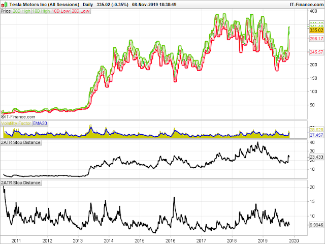
As an example, here is a daily chart of Tesla where I have zoomed out on the chart to cover its complete trading history:

In this example there are two 2ATR stop distance windows below the chart - as this is a US stock, the top indicator is expressed purely in dollar terms as normal, whereas the reading underneath is expressed in percentage terms of the price at that time.
You can see how, during the middle of 2015, the 2ATR reading was at its historical low in percentage terms (less than 4.5%) when the stock was priced at around $250. In Dollar terms at this time the 2ATR reading was just over $11.
As a comparison, back in 2011 / 12, when the stock was priced at less than $40, the 2ATR reading in Dollar terms was oscillating between $2 and just over $3, yet when this is expressed as a percentage of price, the reading is in the range of 7% - 13%.
With the monetary 2ATR reading, you can see how this mirrors more closely the fluctuations in price as shown on the main chart.
With the percentage reading, this maps out a different path with various peaks and troughs showing when the 2ATR measurement, would have given you a better picture of when 'true' volatility contraction is taking place.
I've not seen too many examples of people looking and interpreting ATR in this way, but it may help you view significantly different priced stocks or instruments and evaluate them in a new light, and identify potential opportunities of volatility contraction that may not be obvious if looking purely at the usual monetary measurement.

I like it ................
ReplyDeleteI think something can be done with this info.
Thank you!